
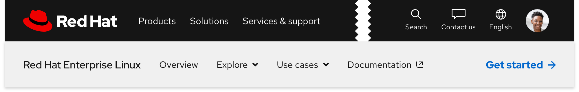
Navigation (secondary)
Overview
The Secondary navigation is used to connect a series of pages together. It displays wayfinding content and links relevant to the page it is placed on. It should be used in conjunction with the Primary navigation.
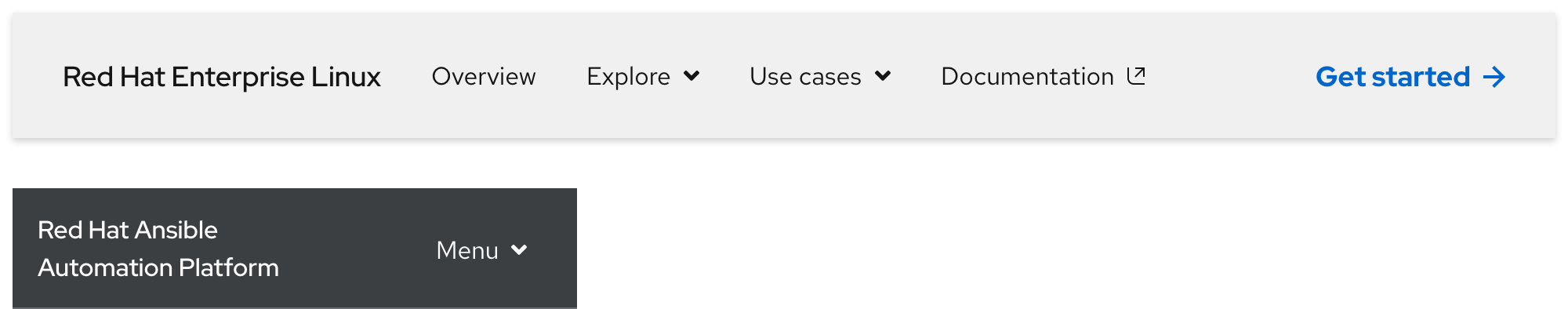
Sample component
Demo
View a live version of this component to see how it can be customized.
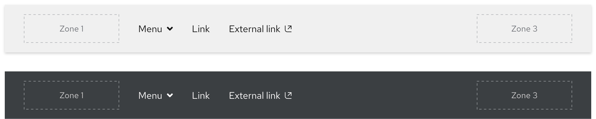
Anatomy
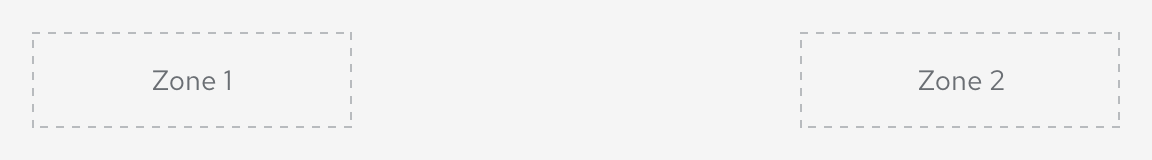
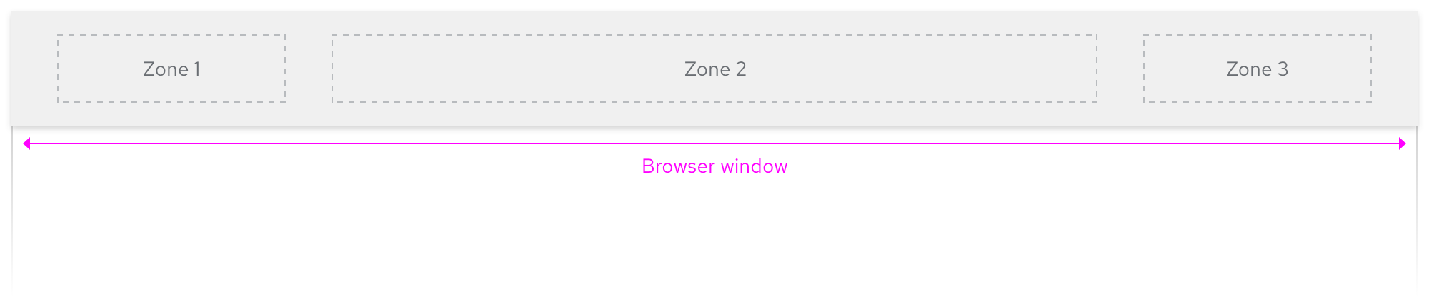
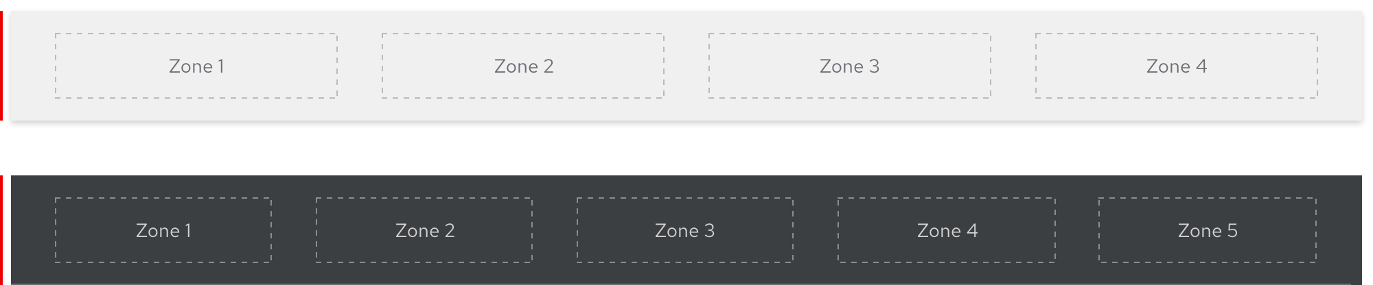
Introduction to zones
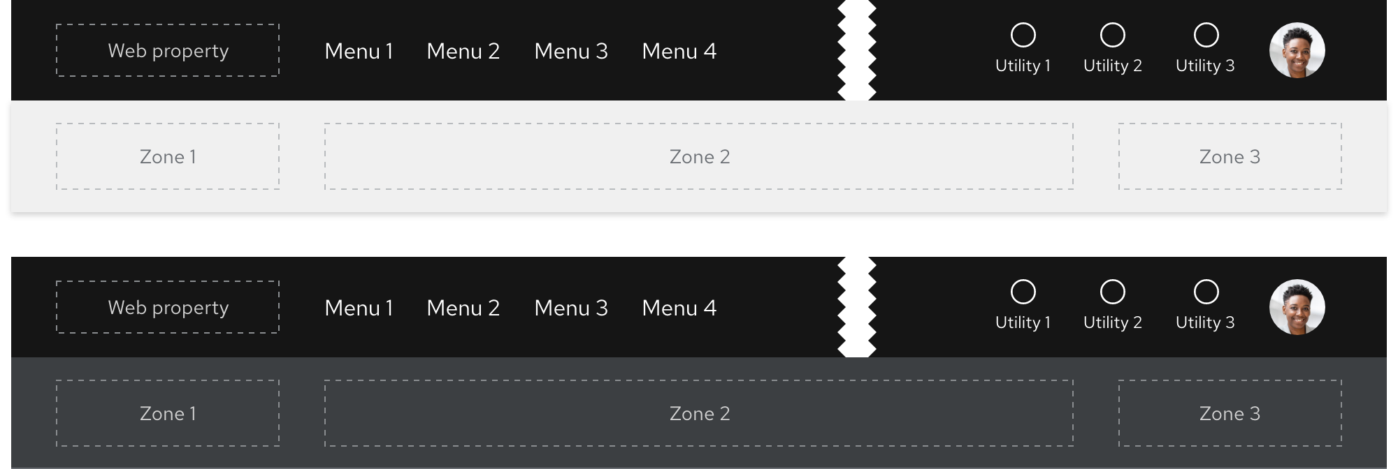
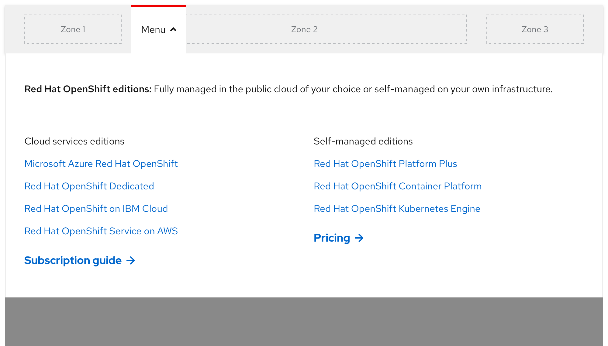
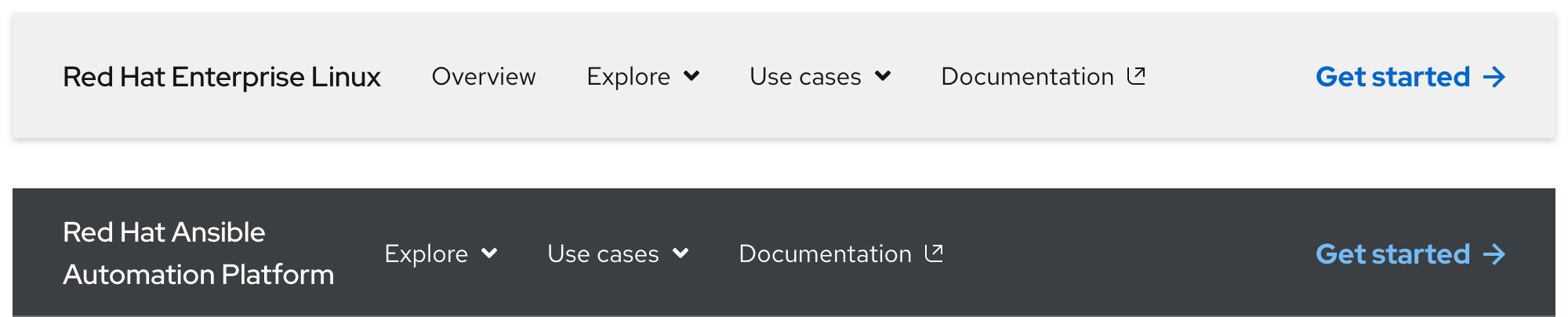
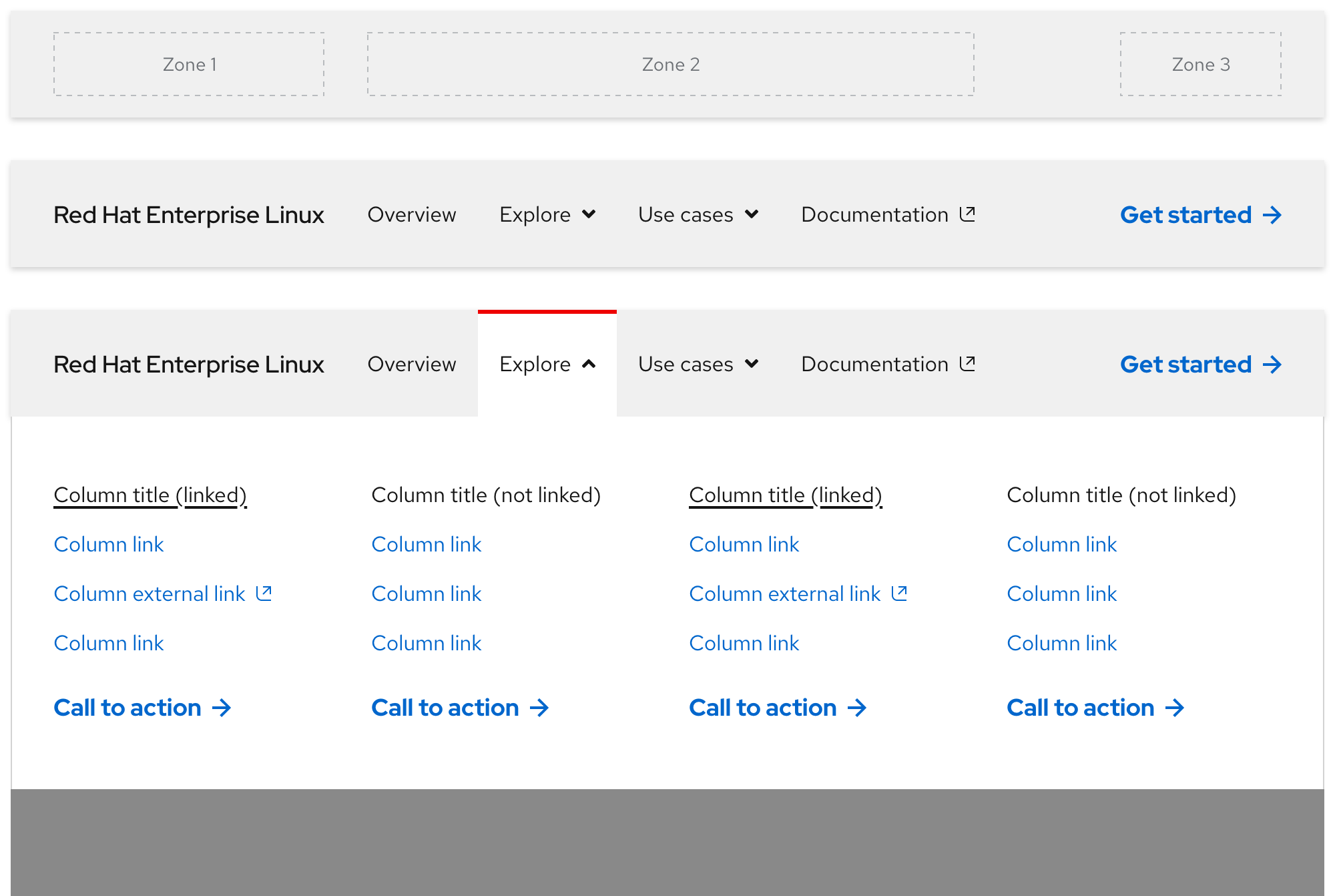
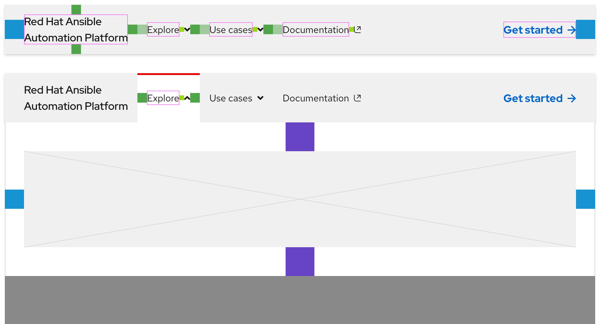
The secondary navigation is divided into three zones where content can be placed. Each zone may include custom content and elements in certain zones will collapse or become hidden completely as breakpoints get smaller. It is not required to use all three zones.
- Zone 1 - Includes primary elements that are representative of the experience or series of pages
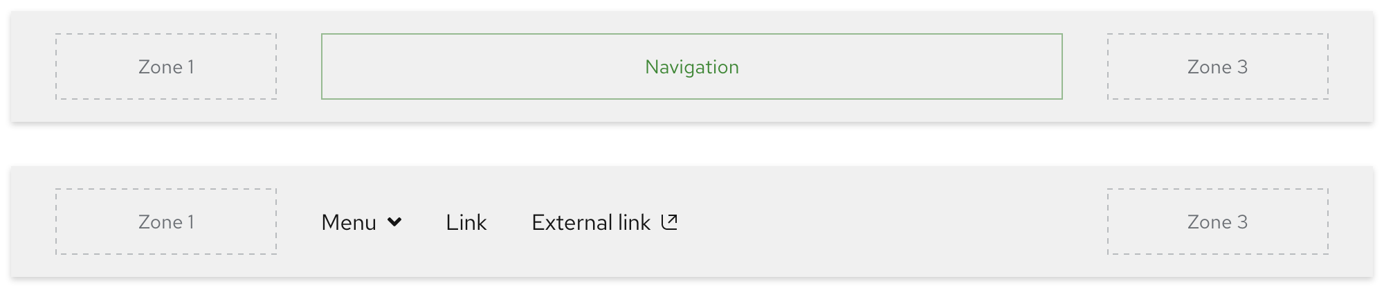
- Zone 2 - Includes navigation elements like menus and links
- Zone 3 - Includes secondary elements that provide additional actions
Helpful tip
Content in Zone 1 should be linked and direct visitors to the main page of the experience when selected.

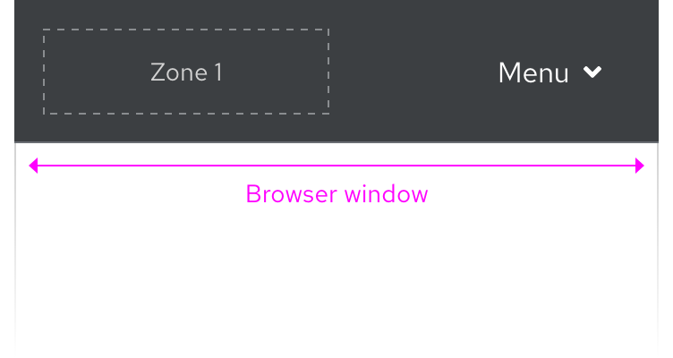
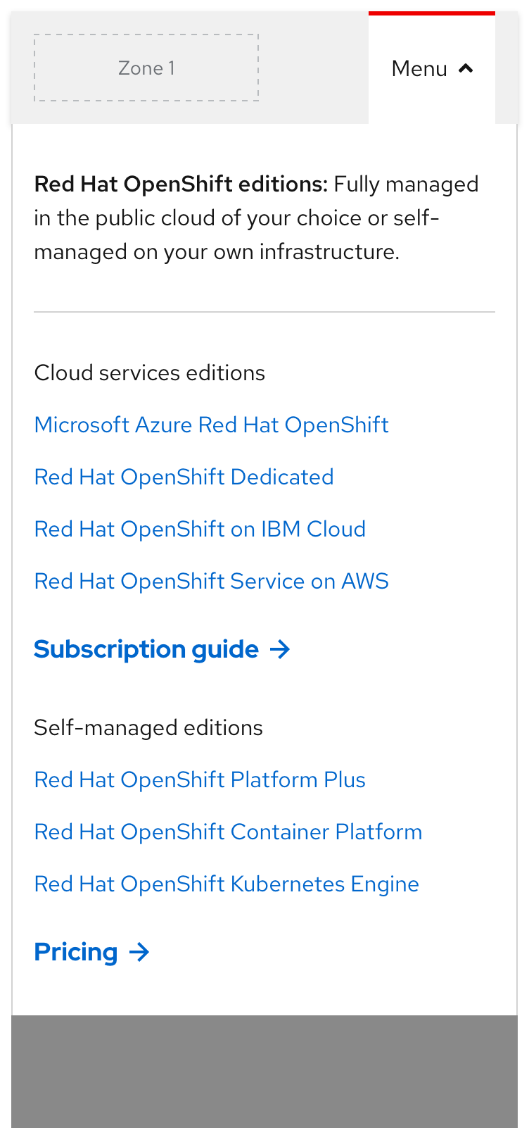
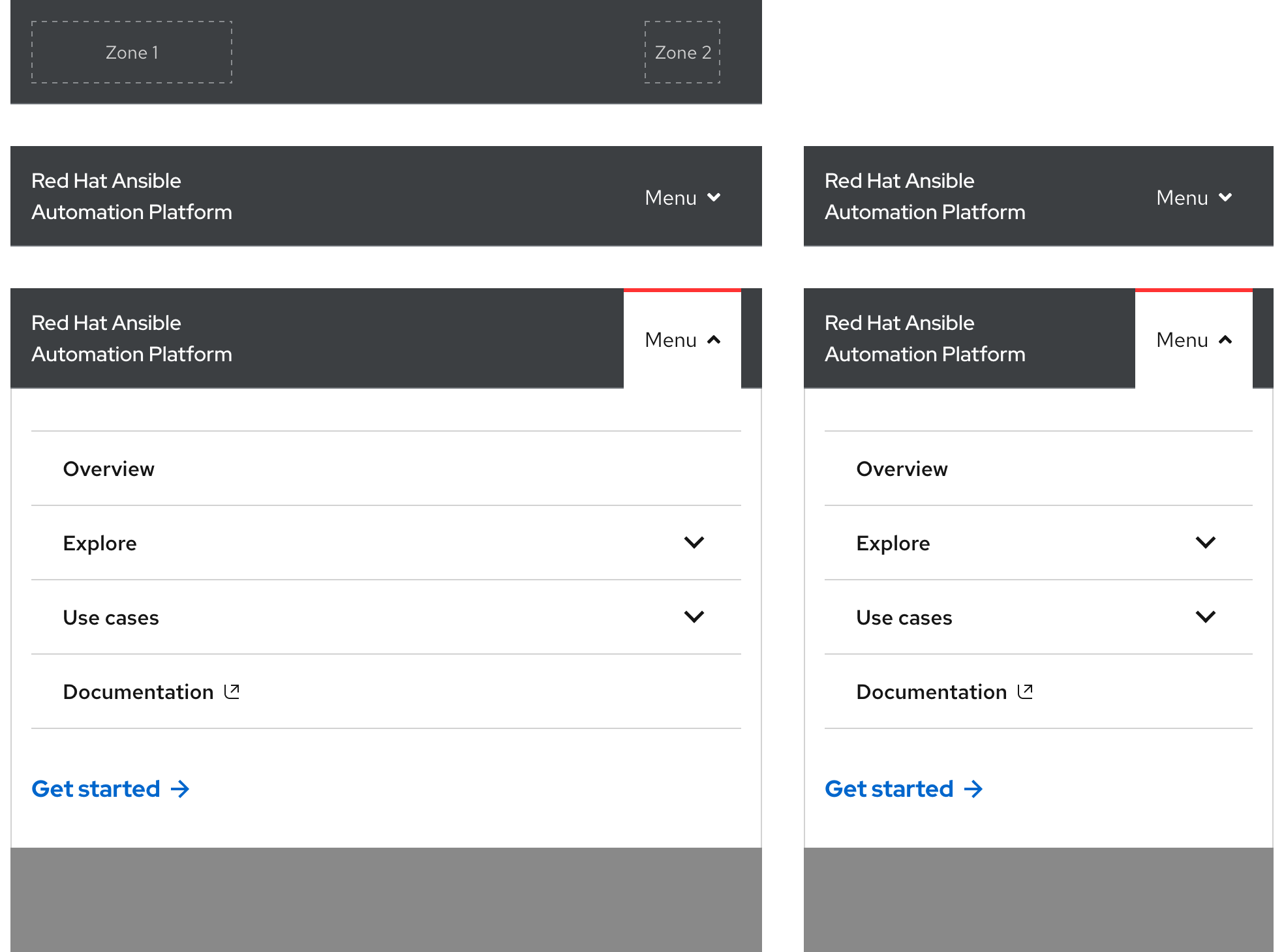
Zones on small breakpoints
On small breakpoints, navigation elements in Zone 2 will collapse into an accordion within a menu. Content in Zone 3 will either be positioned below the accordion or be hidden completely.
Style
Themes
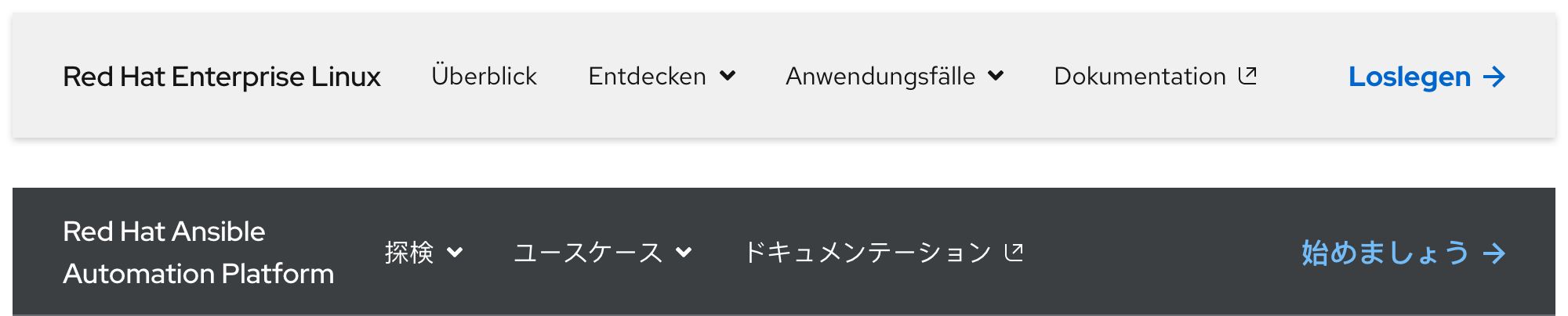
The secondary navigation is used on a variety of pages so it requires a variety of themes. The goal for the secondary navigation is to blend in with its surroundings in order to avoid clashing or competing with other important components.
Choosing a theme
When thinking about choosing a theme, consider the goal of the page as well as what the design is or will be. Ideally, the chosen theme matches the rest of the page design while providing a seamless browsing experience.
Theme options
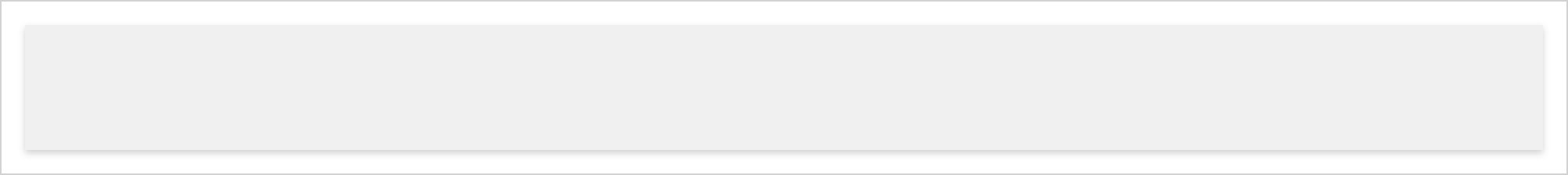
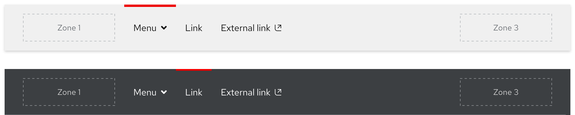
The light theme features a light gray background and a drop shadow, it is best used on pages with a lighter look and feel. The drop shadow is always visible unless covered by an expandable tray.
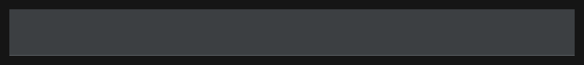
The dark theme features a dark gray background and a thin gray line, it is best used on pages with a darker look and feel. The thin gray line is always visible unless covered by an expandable tray.
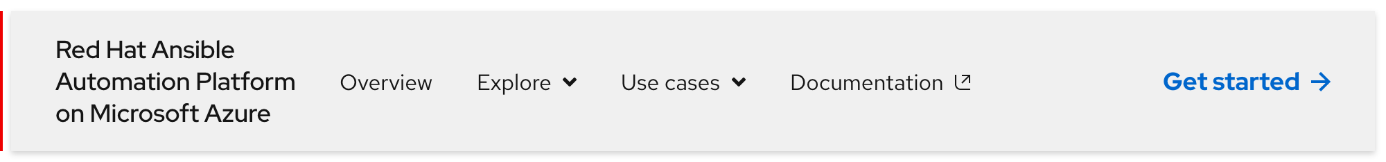
Product name text styling
If the secondary navigation is used to connect product-like pages, Zone 1 should display the product name in the form of linked text instead of the logo.
Warning
Various styling treatments were explored for the product name text, do not deviate from any of these styles.
| Breakpoint | Style |
|---|---|
| Large breakpoints | Red Hat Display, Medium / 18px, 27 (1.5 line height) |
| Small breakpoints | Red Hat Display, Medium / 16px, 24 (1.5 line height) |
Navigation text styles
Navigation text styles have the same styling across all themes like font family, size, and line height. However, the color will change between black and white depending on the chosen theme.
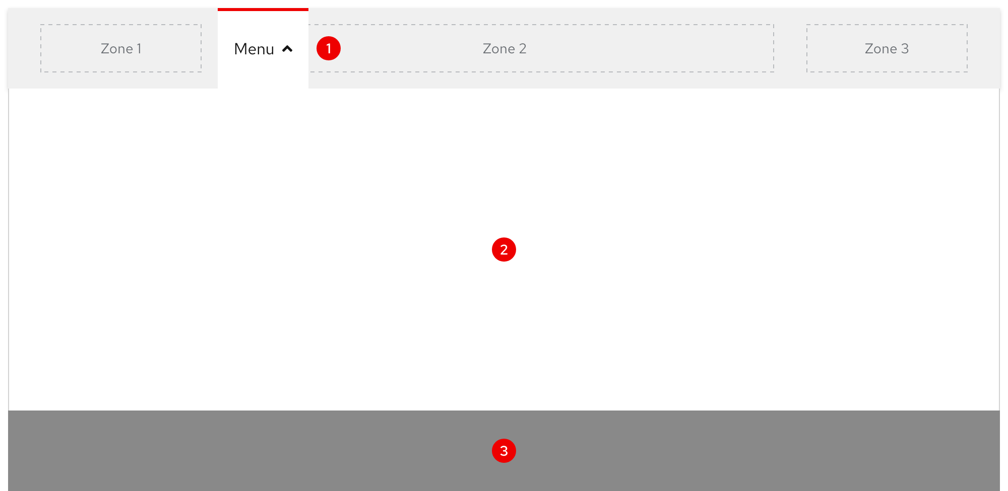
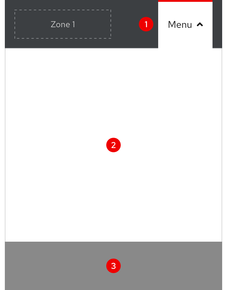
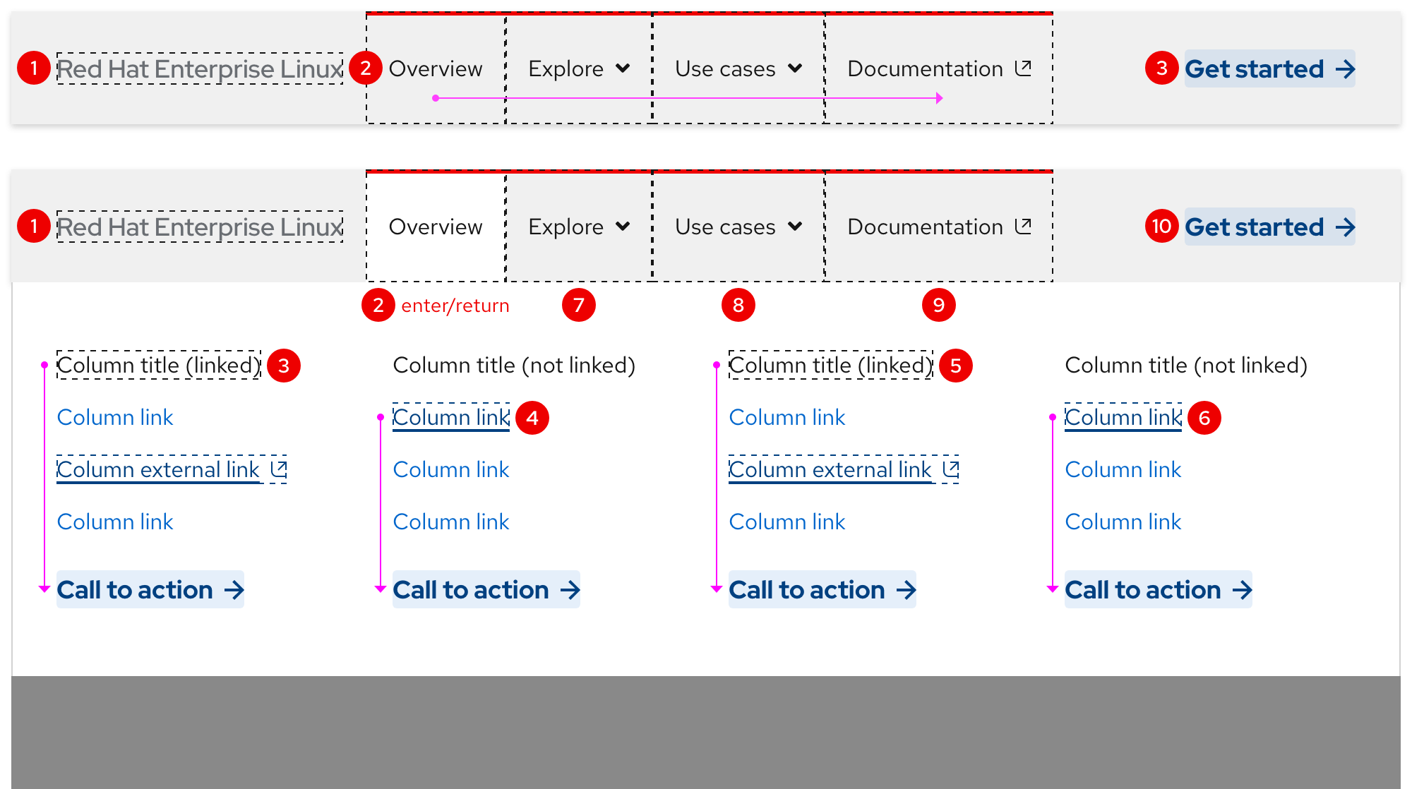
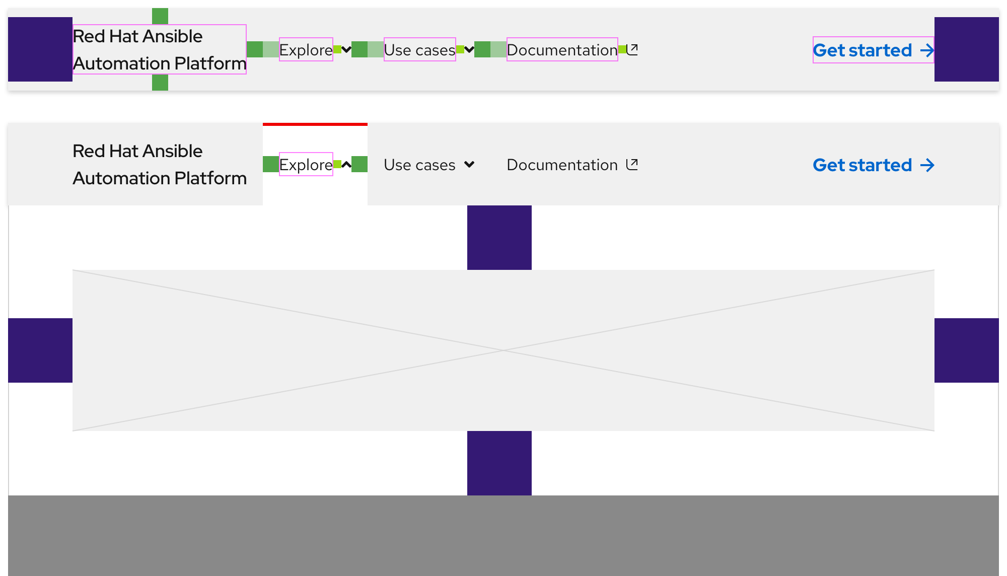
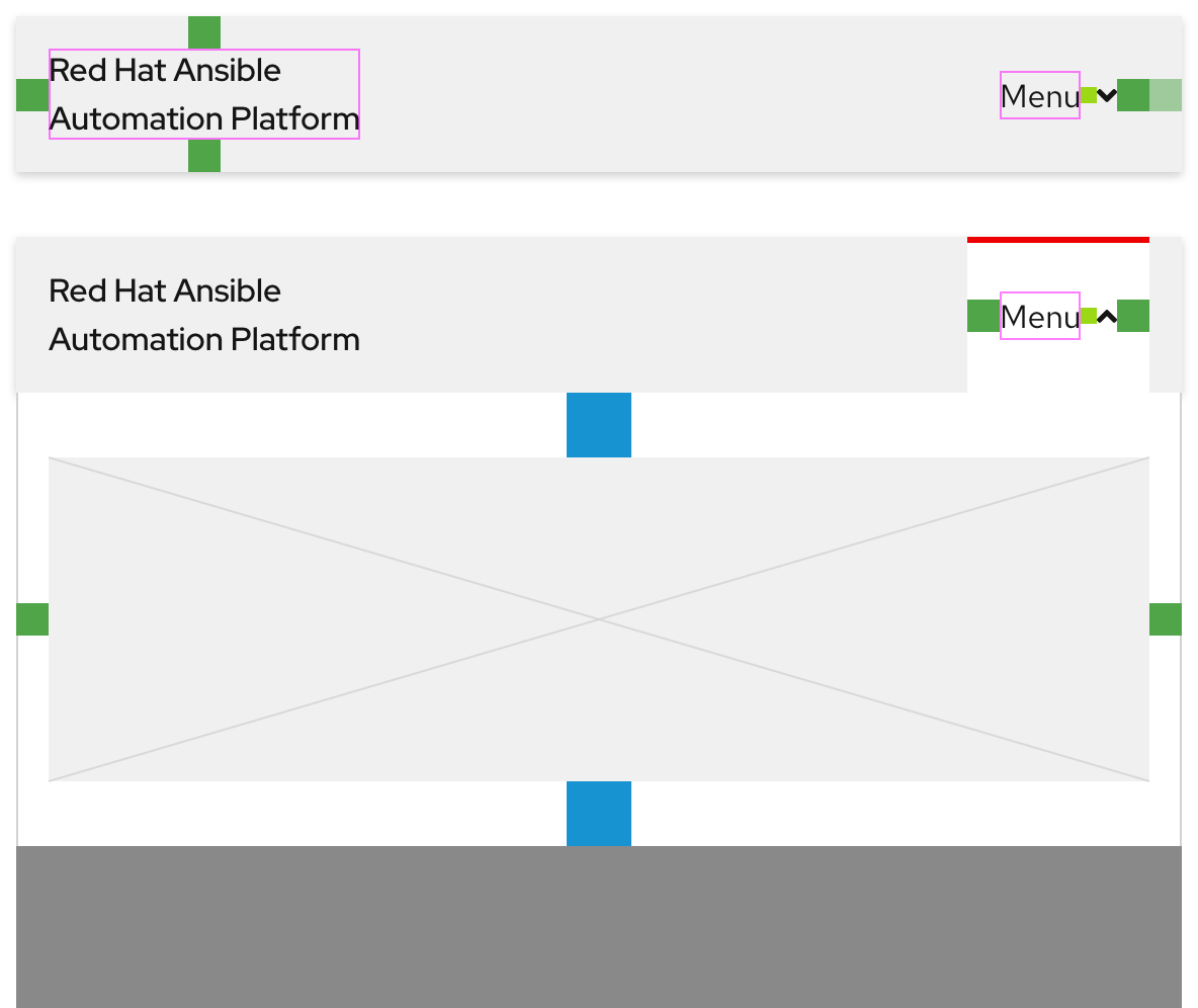
Expandable tray
If content in Zone 2 includes a menu and when that menu text is selected, an expandable tray will appear. It is divided into three parts and is styled the same across all themes.
- Tab - Visually indicates what menu is expanded
- Tray - The area where content or other components can be placed
- Overlay - A transparent background that helps elevate the component above the page underneath
Helpful tip
When a menu is expanded, the arrow icon next to the menu text will flip to point up.
Layout
The secondary navigation spans the entire width of the browser window on all breakpoints.
Left-to-right languages
When content is translated to other left-to-right languages, the layout and text size remains the same.
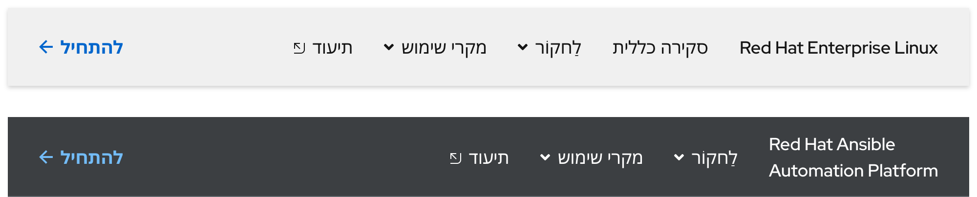
Right-to-left languages
When content is translated to a right-to-left language like Hebrew, the text size will increase which makes it easier to understand visual subtleties of unique characters.
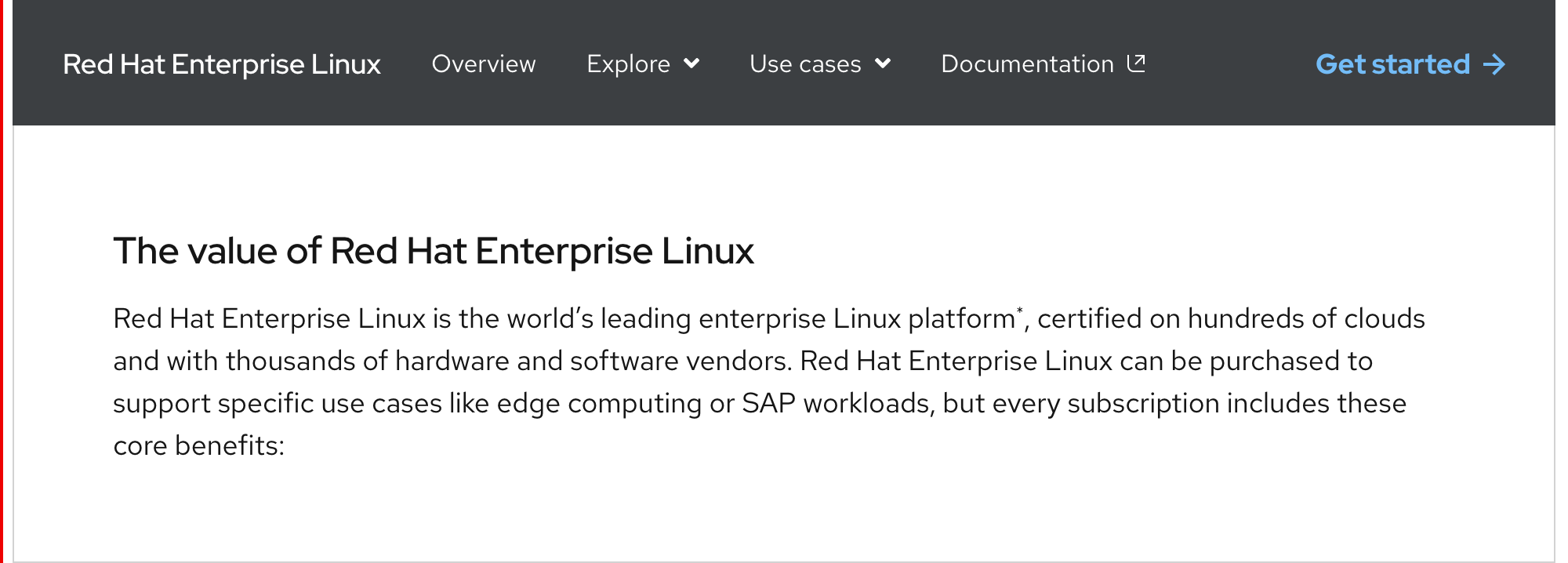
Usage
Secondary navigation
The Secondary navigation is used to connect a series of pages together. It should be used as a supporting navigation component and not on its own.
Helpful tip
Websites that require only one navigation should use the primary navigation.
Product name text stacking
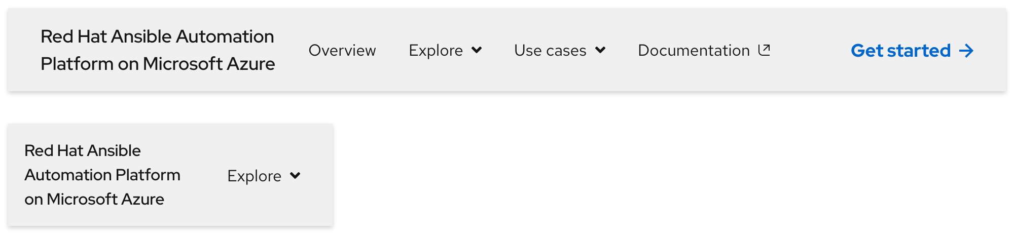
If the secondary navigation is used to connect product-like pages, Zone 1 should display the product name in the form of linked text. If this text is short enough and there are fewer menus and links, it can remain on one line.
Warning
Do not truncate product name text or break it to three lines except in extreme cases on small breakpoints.

Product name text should break to two lines where it makes sense, otherwise more space will be occupied than necessary.
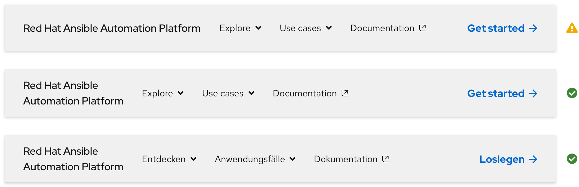
In some rare cases, if product name text is extremely long, it will naturally break to three lines on small breakpoints.
This extremely small breakpoint example is 320px
Navigation slots
Use Zone 2 to place navigation elements like menus and links. Typically, they are positioned on the left side next to Zone 1. The specific order of menus and links is up to content strategists.
Writing navigation content
Navigation elements provide options for visitors to browse through relevant content. Be aware of the following when writing content for Zone 2:
- At least one menu or link should be included
- A maximum of five menus and links can be included if the text is short
- It is best to write all text as short as possible
- If product name text or a call to action is included, they can sometimes have lots of characters
- If a call to action is included, it will not stack to make room for more text
- Text will more than likely expand when translated to other languages
Warning
Featuring too many menus and links can lead to visual crowding and choice paralysis for visitors.
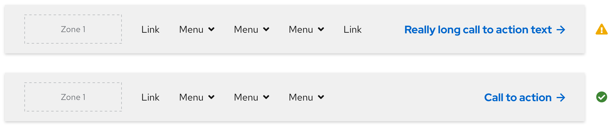
| Element | Maximum slots | Maximum characters |
|---|---|---|
| Product name text | 1 | N/A |
| Menus and links | 5 | 25* |
| Call to action | 1 | 20 |
* If there are fewer menus and links in Zone 2, more characters can be written; if there are more menus and links, fewer characters can be written
Expandable tray
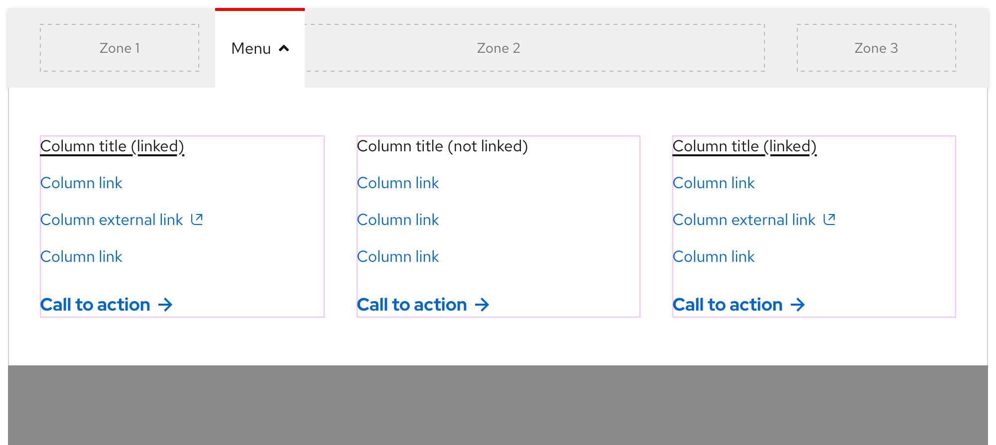
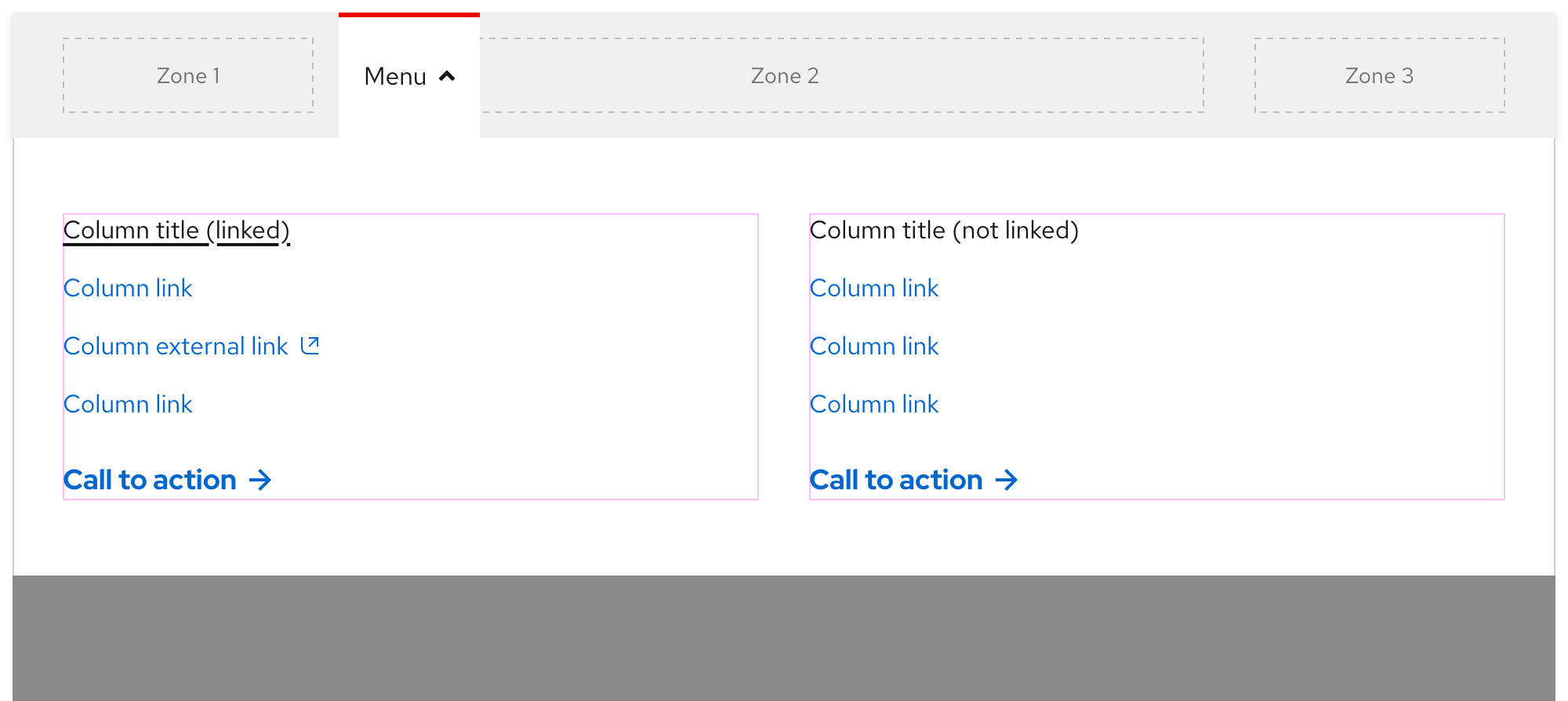
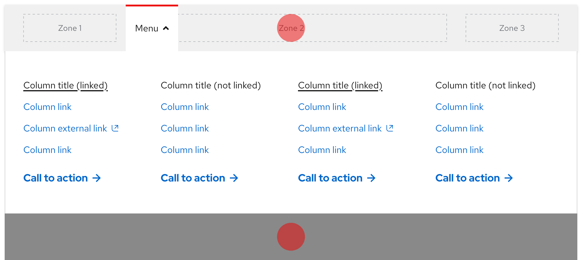
Use the expandable tray to organize content in two, three, or four columns. Positioning a call to action under a column of text will ensure that both elements will remain in the same arrangement when stacked on small breakpoints.
Warning
Do not use more than four columns in the expandable tray, consider reducing the amount of content instead.
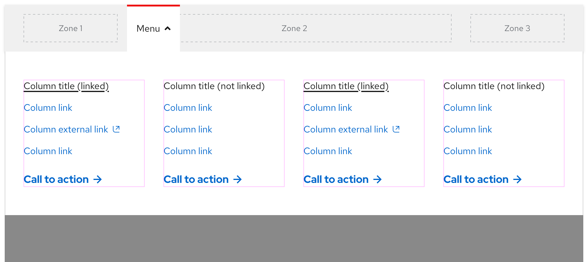
If content is organized in fewer than four columns, the containers will stretch to fill the empty space.
Writing expandable tray content
The expandable tray allows visitors to see a larger amount of relevant content. Elements that may be used include text, links, calls to action, and horizontal rules. Be aware of the following when writing content for the expandable tray:
- It is best to write all text as short as possible
- Do not stack lots of links in the same column
- Do not use too many different call to action variants
- Text will more than likely expand when translated to other languages
- All text will stack on small breakpoints, so content positioned towards the left will be on top
Warning
Featuring too much content can lead to choice paralysis and visitors not seeing key information because they have to scroll.
Behavior
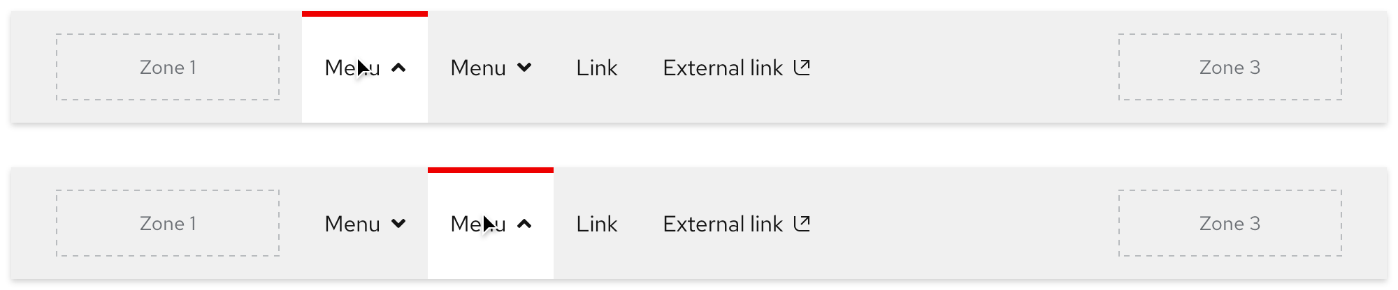
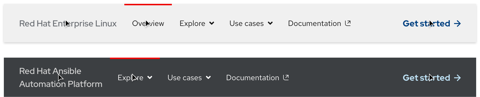
Current page indicator
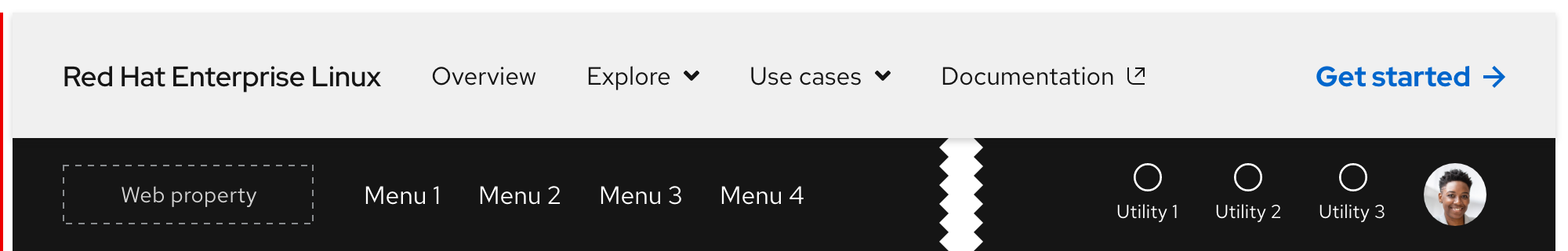
When a visitor is viewing a page that is part of the secondary navigation IA, a red bar will appear above the corresponding menu or link. External links will not display the top red bar (except on hover) because they direct visitors to a new tab or window when selected.
Scrolling with primary navigation
When the secondary navigation is used in conjunction with the primary navigation, it is positioned underneath. When a visitor scrolls down, the primary navigation will disappear and the secondary navigation will remain sticky.
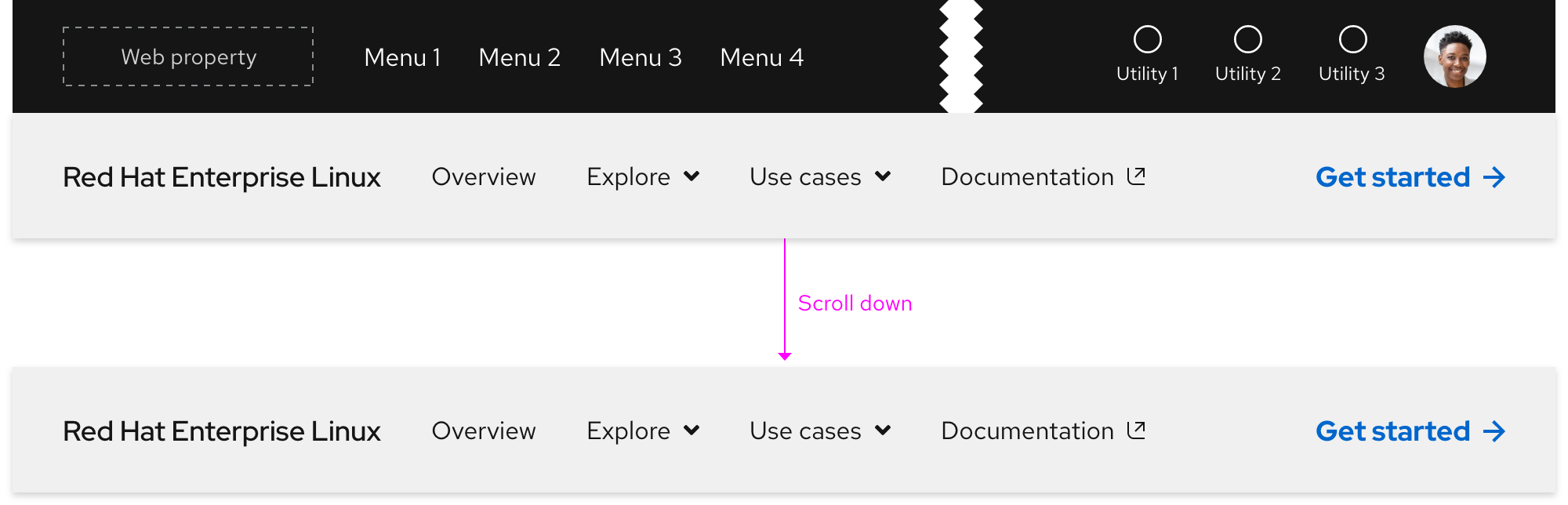
When a visitor scrolls to the top of the page, the secondary navigation will reset underneath the primary navigation.

Scrolling with expandable tray
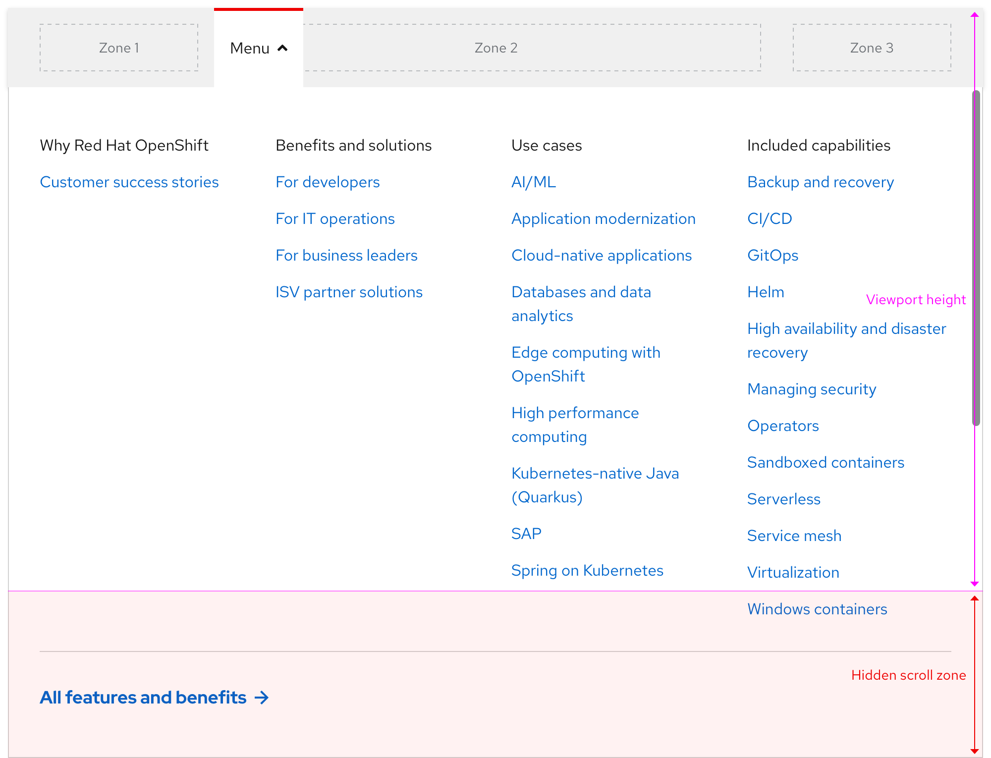
If the height of the expandable tray is shorter than the viewport, content will scroll underneath.
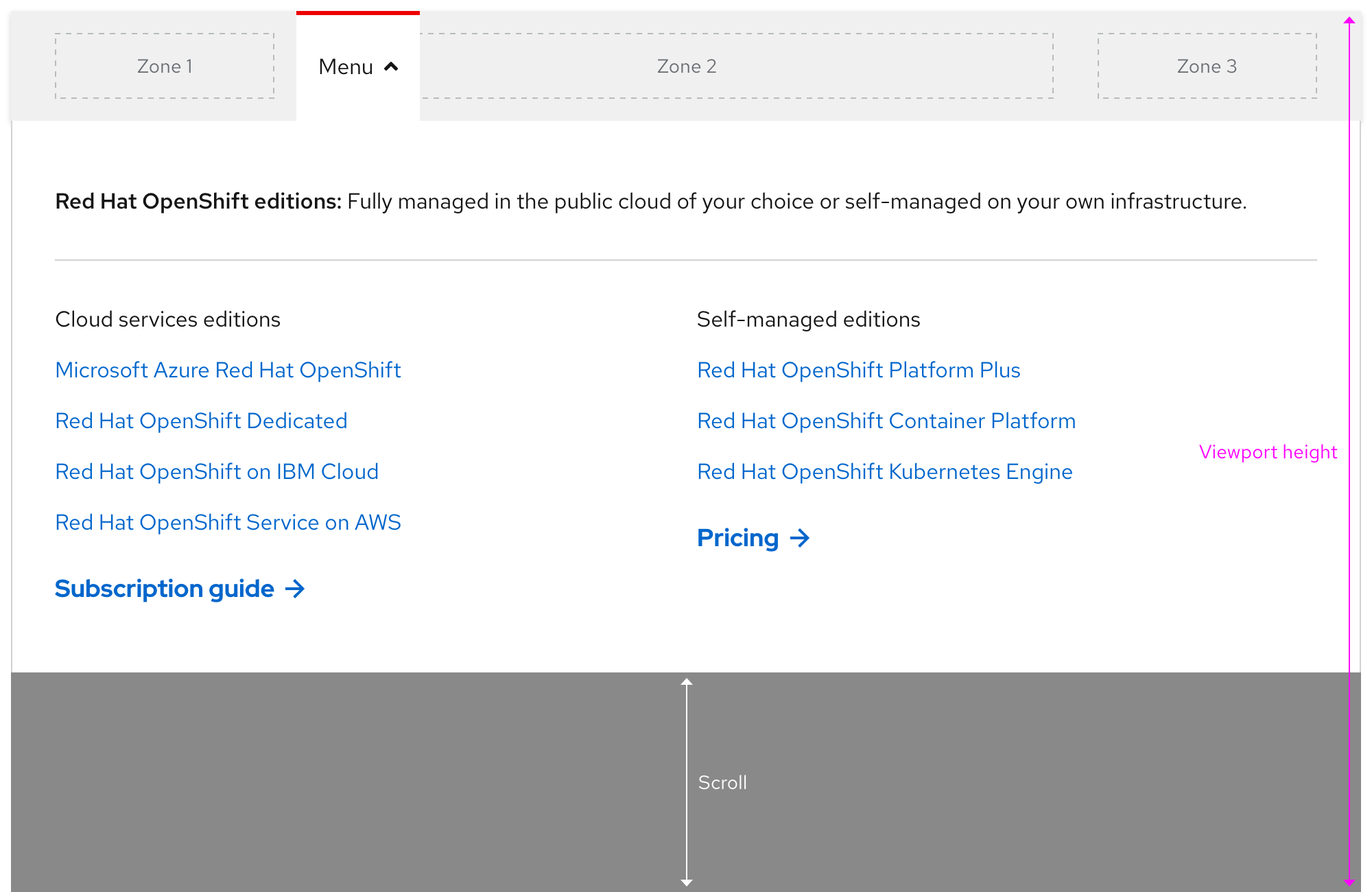
If the height of the expandable tray is taller than the viewport, the tray will scroll instead.
Navigating between expandable trays
Only one expandable tray can be expanded at a time and there is no animation when navigating from one tray to the next.
Collapsing the expandable tray
Clicking or tapping anywhere outside of the expandable tray should collapse it. Pressing the esc key should collapse the expandable tray as well.
Additional behaviors
Keep in mind the following additional behaviors:
- The expandable tray should not collapse or expand without user input by mouse or keyboard
- Scrolling while the expandable tray is visible should not close the tray
Interaction states
Default
| State | Element | Styling |
|---|---|---|
| Default (light theme) | Product name text | RH Display, Medium / 18px, 27 (1.5) / #151515 |
| Default (light theme) | Menu/link text and icons | RH Text, Regular / 16px, 24 (1.5) / #151515 |
| Default (dark theme) | Product name text | RH Display, Medium / 18px, 27 (1.5) / #fff |
| Default (dark theme) | Menu/link text and icons | RH Text, Regular / 16px, 24 (1.5) / #fff |
| Default (all themes) | Call to action text | See the Call to action page for specs |
Hover
| State | Element | Styling |
|---|---|---|
| Hover (light theme) | Product name text | #6a6e73 |
| Hover (dark theme) | Product name text | #d2d2d2 |
| Hover (all themes) | Menu and link top bar | #e00 / 3px thickness |
| Hover (all themes) | Call to action text | See the Call to action page for specs |
Focus
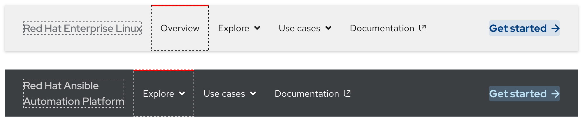
Helpful tip
The focus state carries over styles from the hover state and also adds a focus indicator.
| State | Element | Styling |
|---|---|---|
| Focus (light theme) | Zone 1 | #6a6e73, dashed, 1px border width |
| Focus (light theme) | Zone 2 | #151515, dashed, 1px border width |
| Focus (dark theme) | Zone 1 | #d2d2d2, dashed, 1px border width |
| Focus (dark theme) | Zone 2 | #fff, dashed, 1px border width |
| Focus (all themes) | Zone 3 (call to action) | See the Call to action page for specs |
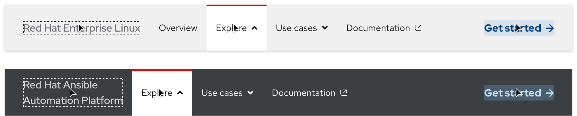
Active
| State | Element | Styling |
|---|---|---|
| Active (all themes) | Tab top bar | #e00 / 3px thickness |
| Active (all themes) | Tab background | #fff |
| Active (all themes) | Menu text and icon | RH Text, Regular / 16px, 24 (1.5) / #151515 |
Accessibility
Tab order
A logical focus order helps visitors understand and operate Red Hat web properties. Elements need to receive focus in an order that preserves meaning, therefore the focus order should make sense and not jump around randomly.
Keyboard events
| Action | Event |
|---|---|
| Tab | Moves the focus forward or to the right |
| Shift + Tab | Moves the focus backwards or to the left |
| Enter or Return | Expands or collapses the expandable tray or selects a link |
| Esc | Collapses the expandable tray |
Click or tap events
| Action | Location | Event |
|---|---|---|
| Click or tap | Anywhere outside of expandable tray | Collapses expandable tray |
Responsive design
Large breakpoints
The secondary navigation includes Zones 1, 2, and 3 on large breakpoints. The content in the expandable tray is also visible.
Small breakpoints
Navigation elements in Zone 2 will collapse into an accordion within a menu. Content in Zone 3 will either be positioned below the accordion or be hidden completely.
Best practices
Incorrect ordering
Do not position the secondary navigation above the primary navigation.
Theme mismatch
Do not use the dark theme secondary navigation in environments with light elements and vice versa.
Content overload
Do not place too many navigation elements in Zone 2.

Adding or removing zones
Do not add more zones than provided.
Product name text on three lines
Do not allow product name text to break to three lines on large breakpoints.
Spacing
The secondary navigation uses spacers to define space values between elements.
Extra large breakpoints
Large breakpoints
Small breakpoints
Feedback
To give feedback about anything on this page, contact us.
Foundations
To learn how to use our other components in your designs, visit the Components section.
